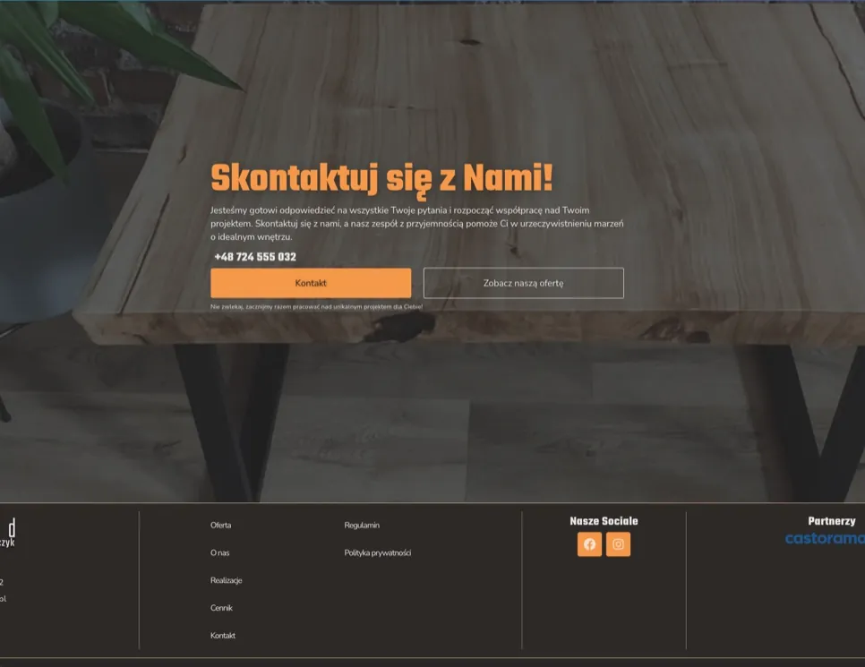

“Dariusz developed the website, refreshed and improved our logo and visual communication, including social media graphics and business cards. We are very happy with his services. The website works perfectly and ranks our company well on Google. We highly recommend Darek for any website work and other visual communication projects!”
About the project
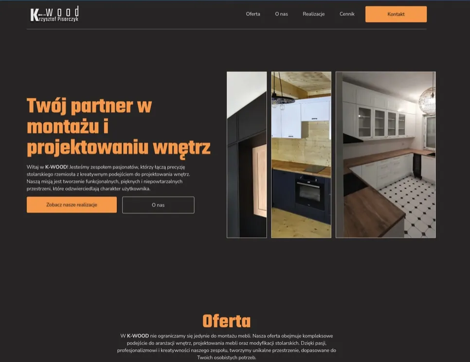
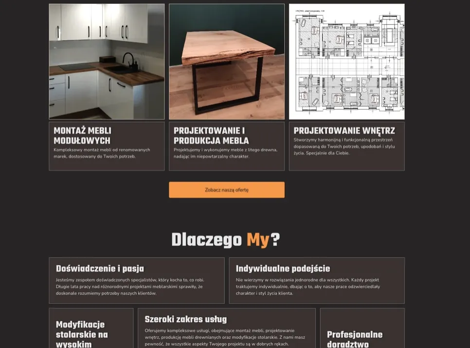
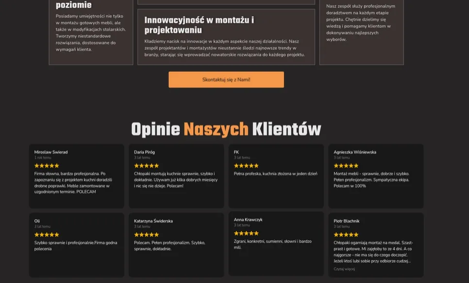
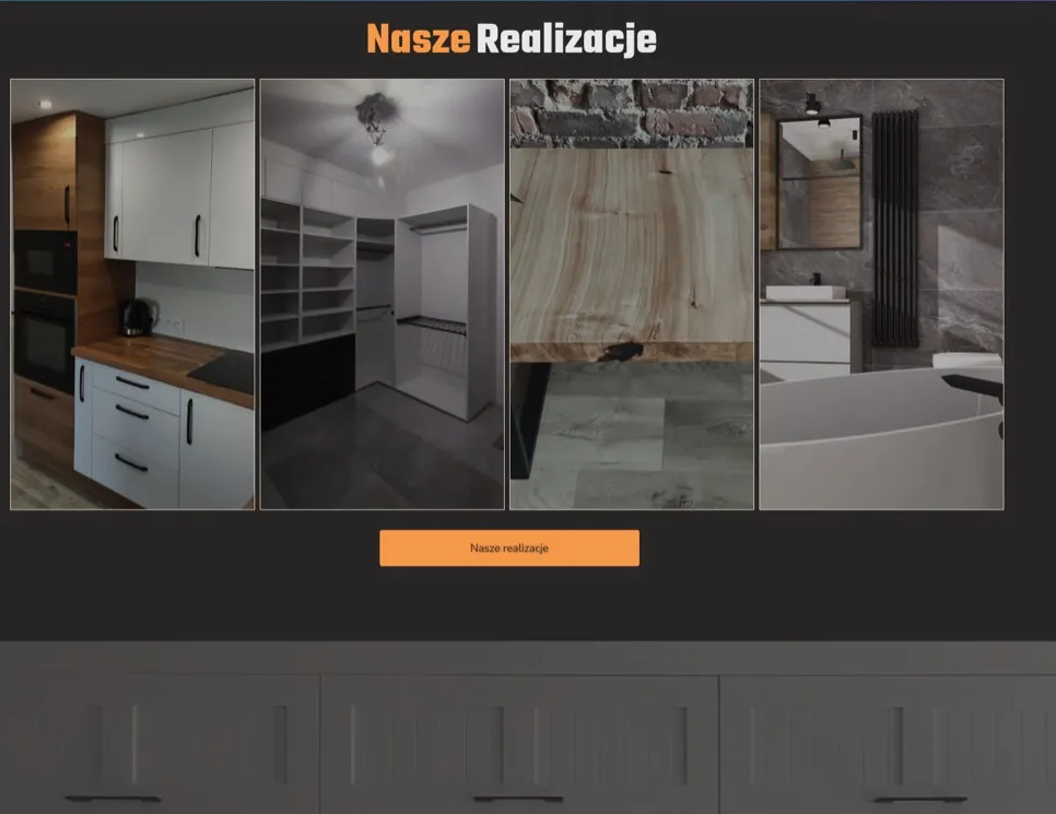
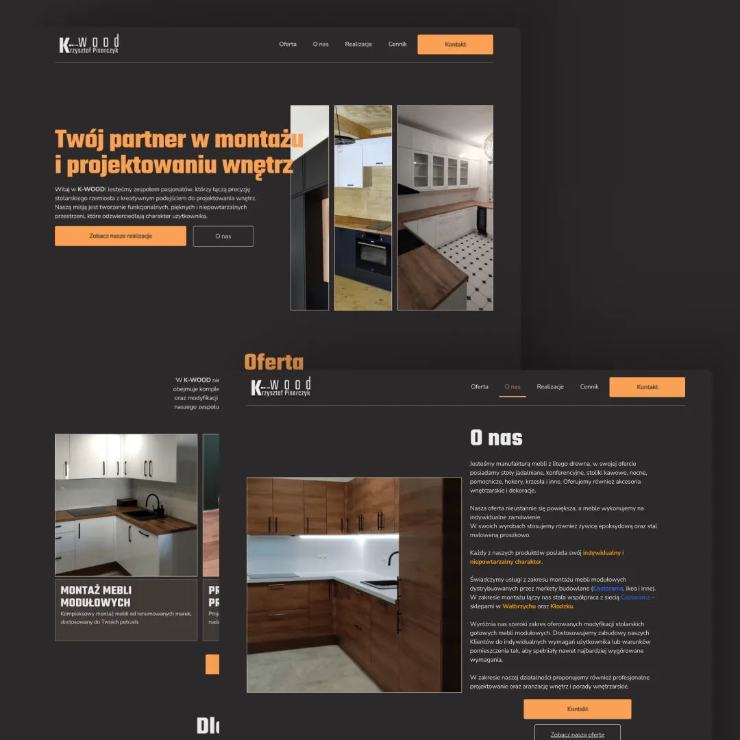
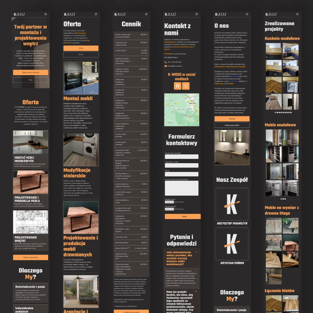
K-WOOD is a company specializing in the production and assembly of solid wood furniture. This project involved designing and developing their first website to establish an online presence and attract more clients. The goal was to create a user-friendly, visually appealing site that highlights the company's services, portfolio, and professionalism, enhancing its brand visibility in the competitive market.
role
I was responsible for all stages of the process, from client requirement analysis to design and implementation
scope
Website, logo refresh, visual communication, social media graphics, business cards
tools
Miro, Figma, WordPress/Elementor, ChatGPT, HTML/CSS, Jitter, Google PageSpeed Insights, GA4
timeline
December 2023 → May 2024
Problem
Before the project, K-WOOD had no online presence, so potential customers had nowhere to find their services or get in touch. Most local competitors weren't doing much better, with weak websites or identical templates that said almost nothing about their services.
Goal
A website that shows K-WOOD's services and finished projects in a way that reflects their craftsmanship, and makes it easy for new customers to get in touch.
Process overview
Click any of the steps to swoosh to the section
Requirement Gathering
Initial meetings and conversations with the client to understand their needs and goals, written down as requirement documentation.
Research
I looked at the furniture assembly market in Lower Silesia. There were plenty of competitors, but very few had a professional website, and many used the same template with hardly any content. From there I mapped the business with a Business Model Canvas, created proto-personas, a customer journey map and an empathy map, and planned the information architecture and user flow.
User flow
- 01Landing on the homepage
Patrycja types the K-WOOD website address into the browser or clicks a link in the search results.
- 02Browsing the offer
On the homepage, Patrycja notices the “Offer” section, where she learns about kitchen furniture assembly, carpentry work, made-to-measure wardrobe design, etc.
- 03Browsing the portfolio
Patrycja goes to the “Portfolio” section to look at completed projects. The company’s visible experience matters to her.
- 04Contact
After browsing the portfolio, Patrycja goes to the “Contact” section and uses the form to send an enquiry about kitchen furniture assembly.
- 05Response from the company
K-WOOD receives Patrycja’s enquiry and replies with information on availability and costs, arranging a meeting to discuss the details.
- 06Signing the contract
After the meeting, Patrycja decides to use K-WOOD’s services. She receives a contract to sign and accepts it electronically.
- 07Furniture assembly
K-WOOD sets a convenient assembly date and gets to work. Patrycja takes an active part in the process, communicating her expectations.
- 08Service review
After the assembly, Patrycja is asked to rate the service and leave a review. The company makes a point of collecting positive reviews on online platforms.
- 09Recommendation and loyalty
Happy with the results, Patrycja shares her positive experience with others. She subscribes to the company’s newsletter and follows it on social media.
Information architecture
Homepage
- Header
- Logo
- Partners
- Client reviews
- CTA “Order assembly”
- Sections “About us”, “Services”, “Projects”, “Contact”
- Offer / Services
- Furniture assembly
- Made-to-measure wardrobe design and assembly
- Carpentry work on wardrobes
- Walk-in wardrobe design and assembly
- Making solid wood tables
- Projects / Portfolio
- Gallery of completed projects
- Descriptions and photos of individual projects
- About us
- Company description / history
- Why us? (Values, unique proposition)
- Certificates
- Pricing
- Contact
- Contact details (phone, address, email)
- Social media
- Opening hours
- Contact form
- Location map
- Footer
- Partners
- Logo
- Terms and conditions
- Social media
- Blog / Interior design tips?
Design
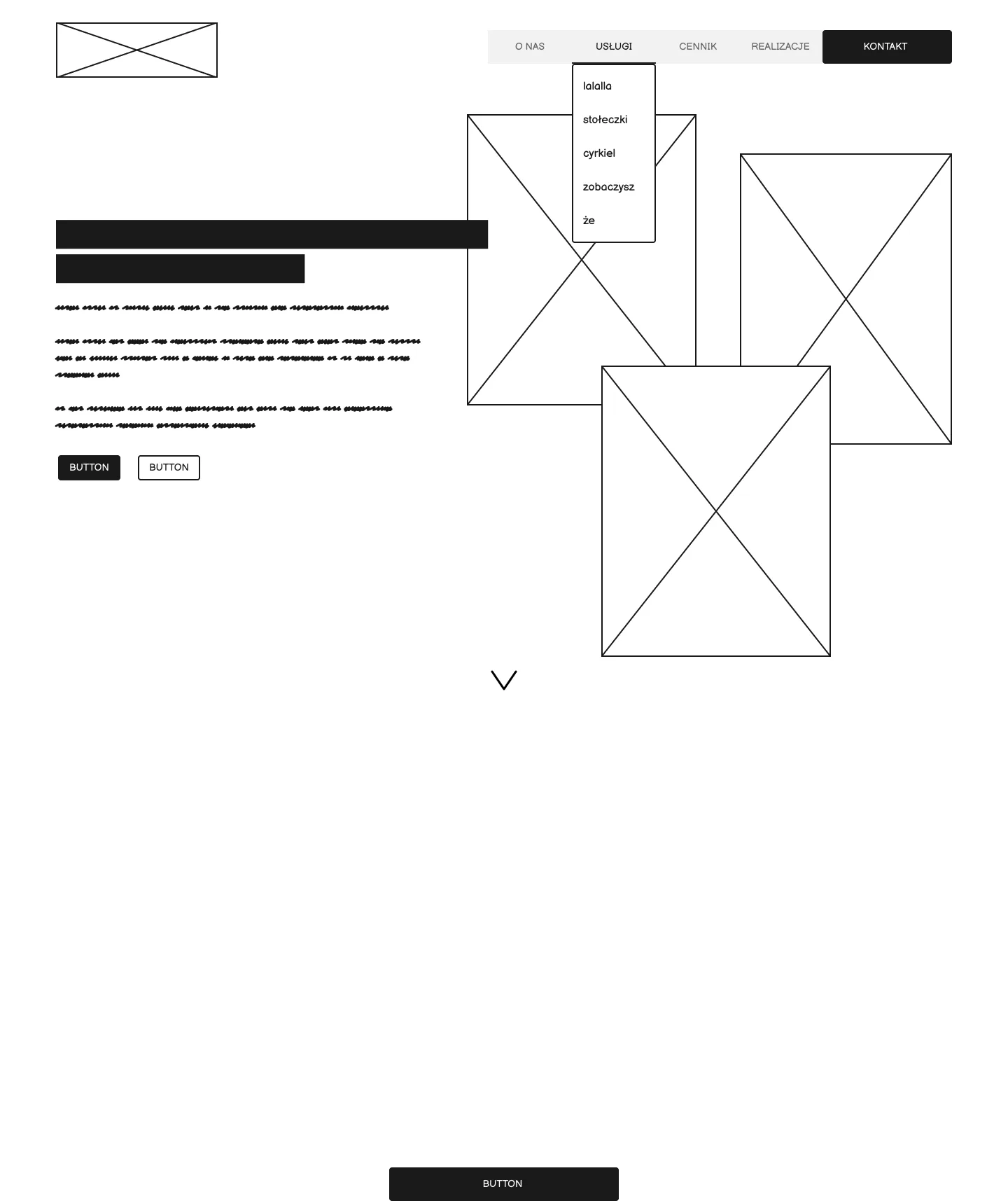
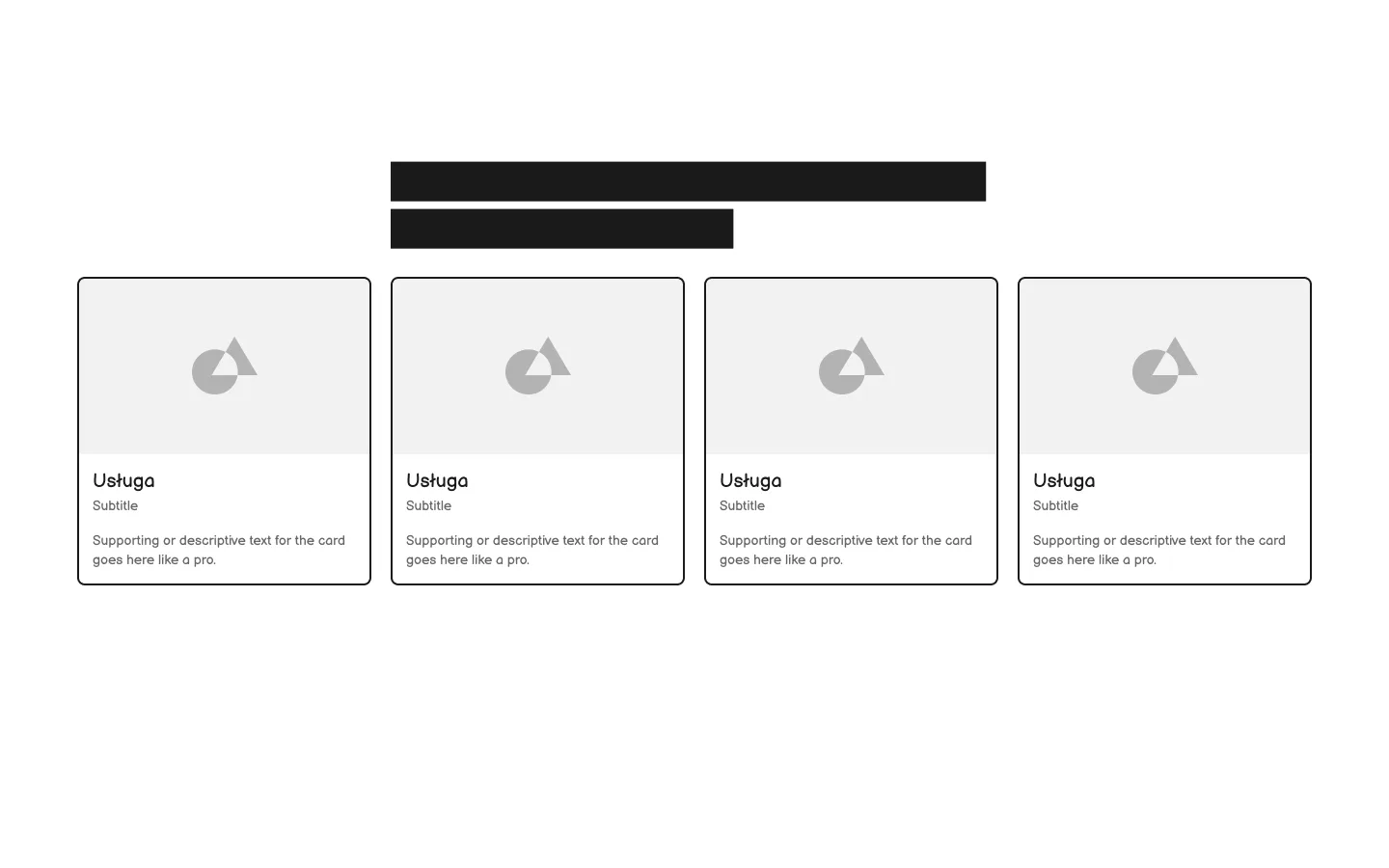
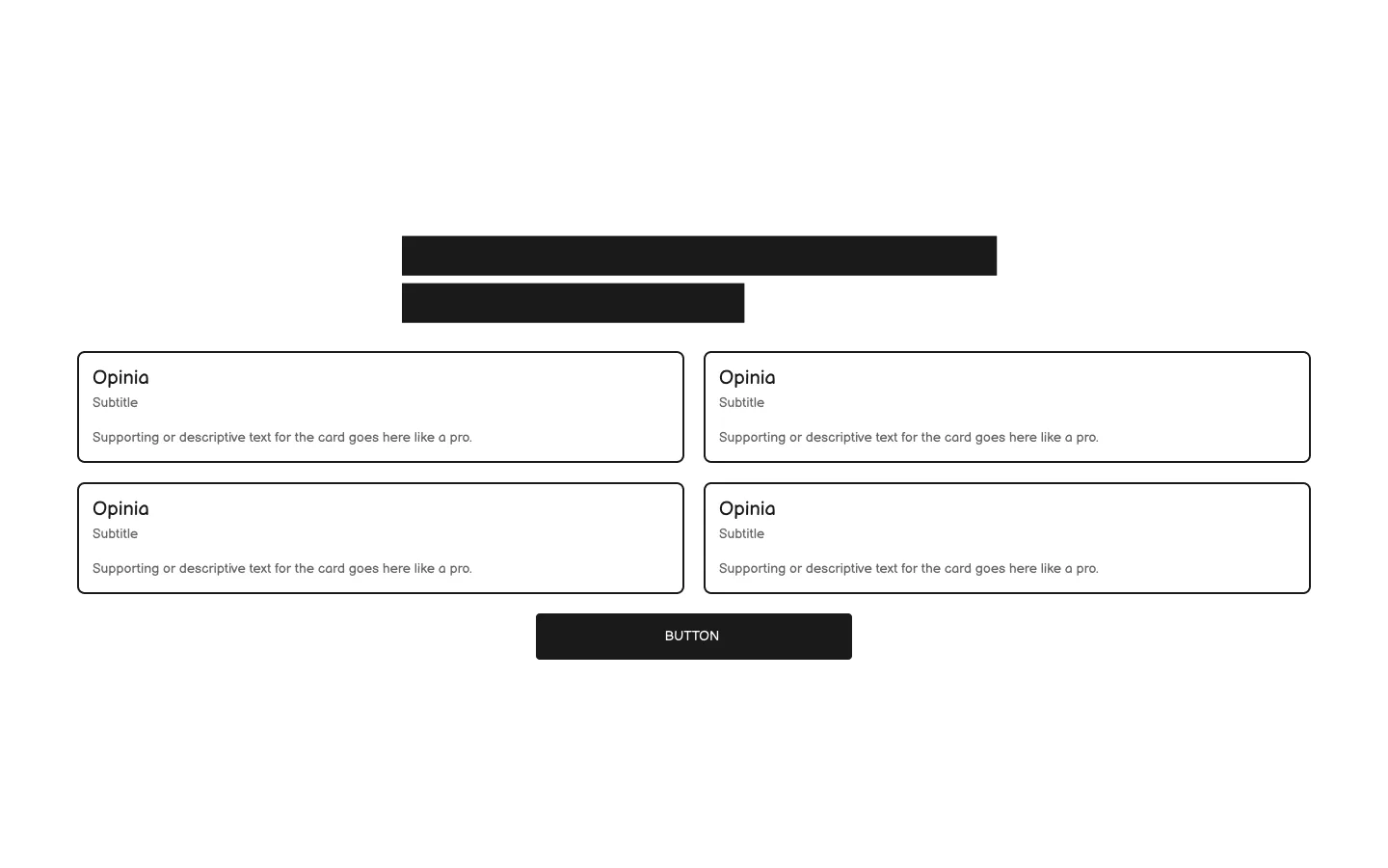
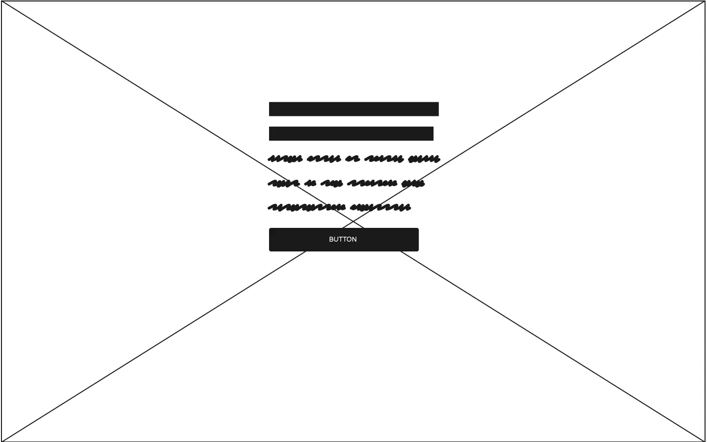
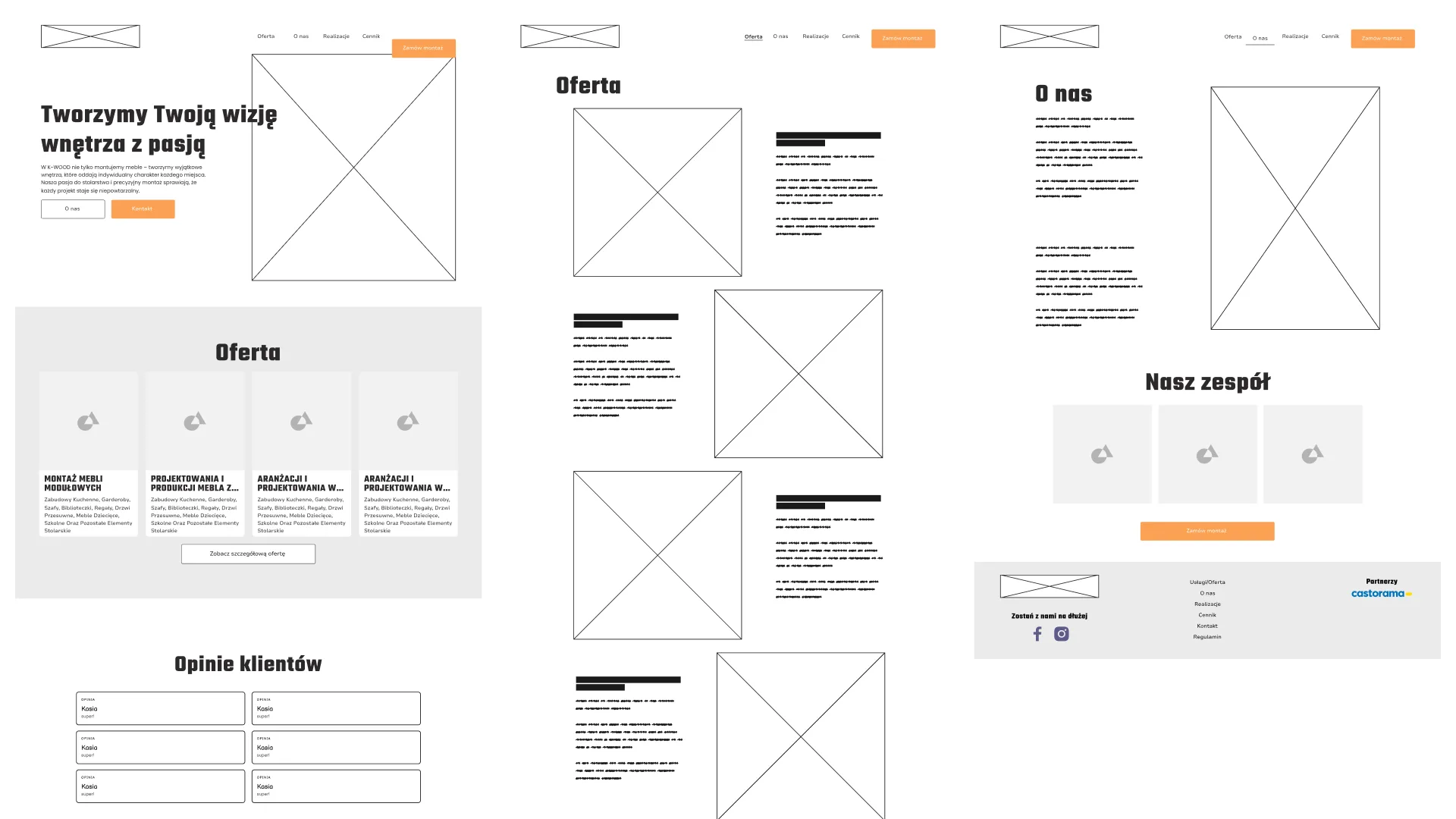
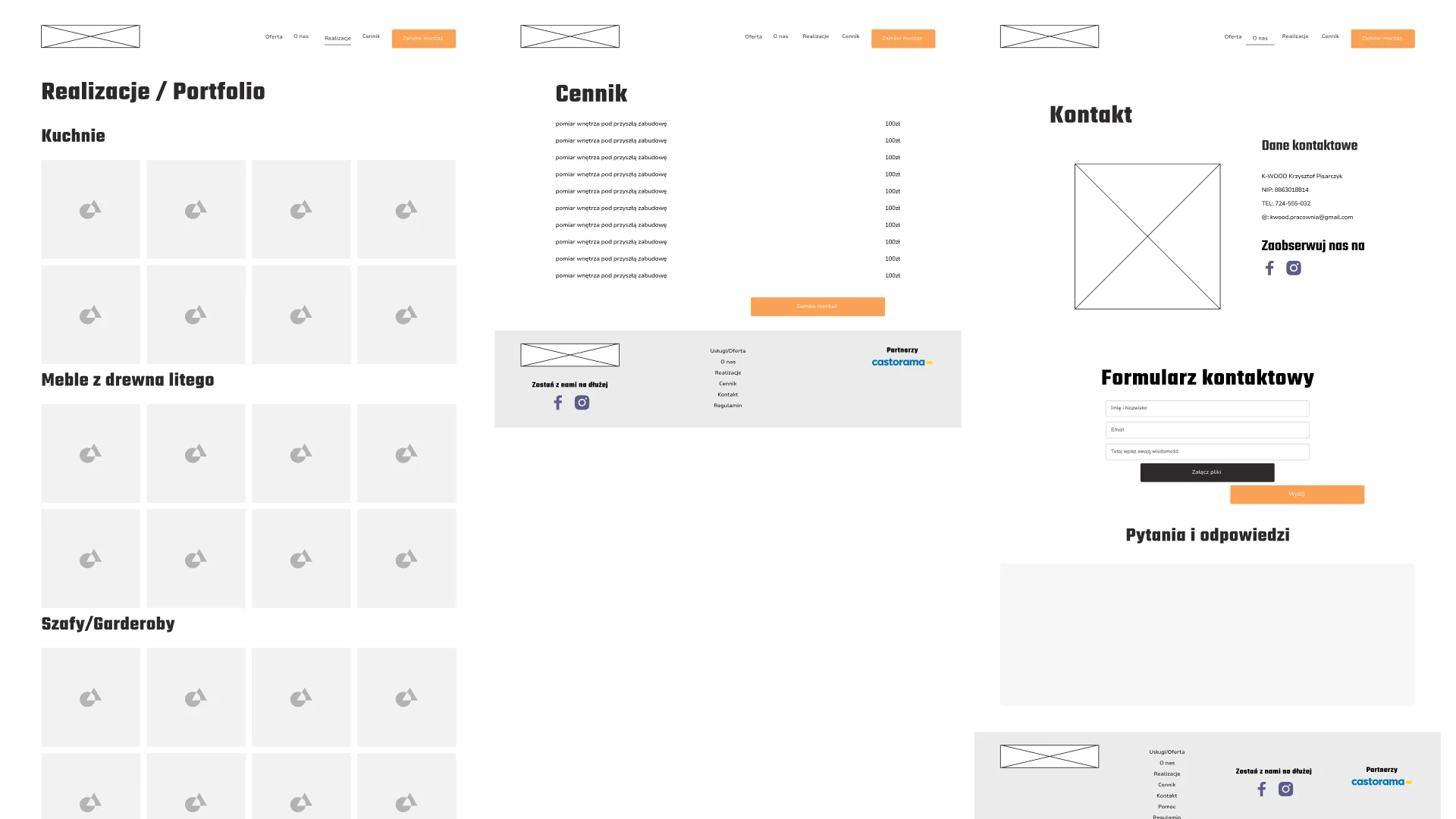
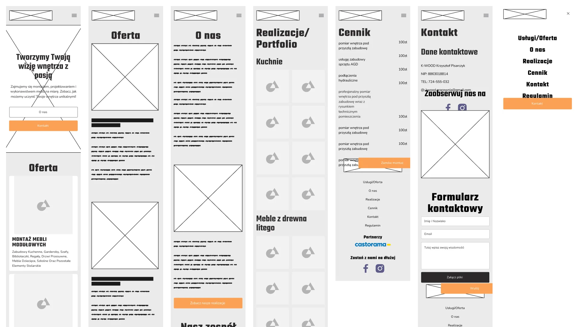
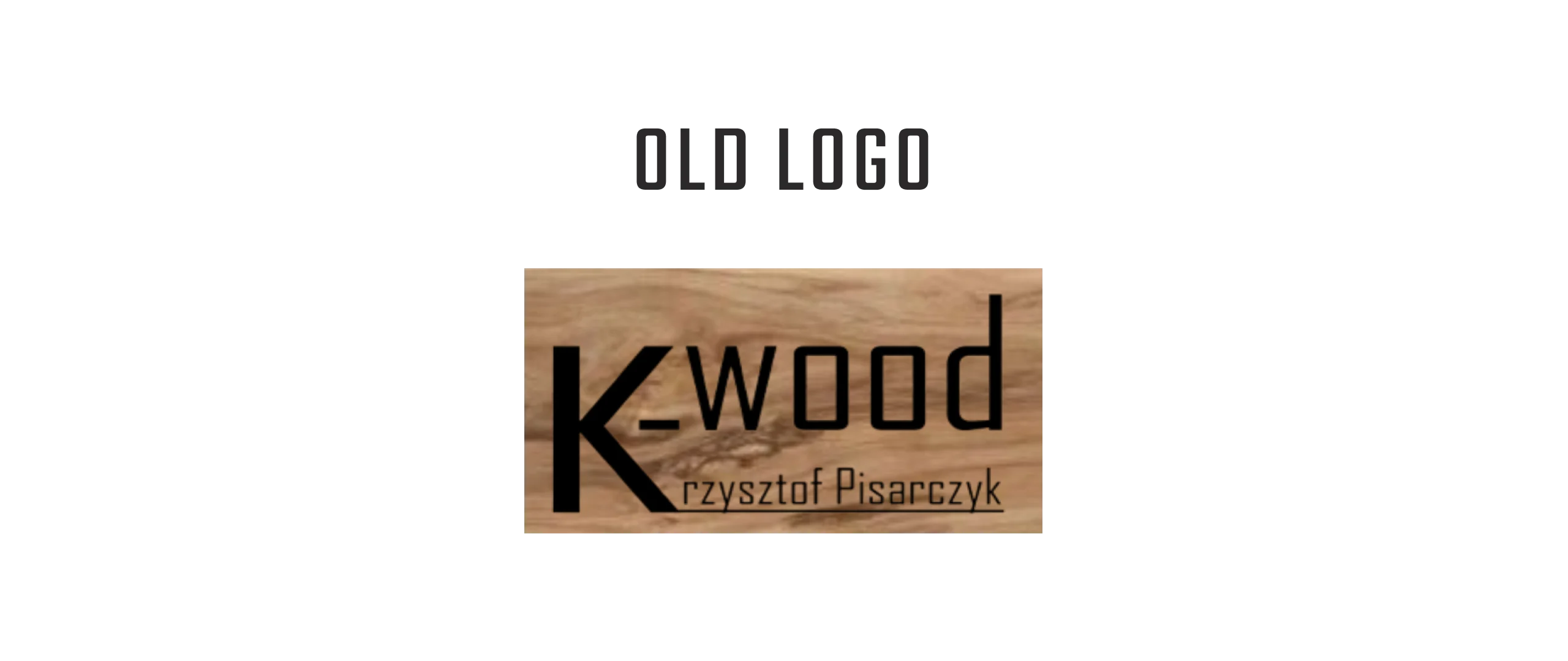
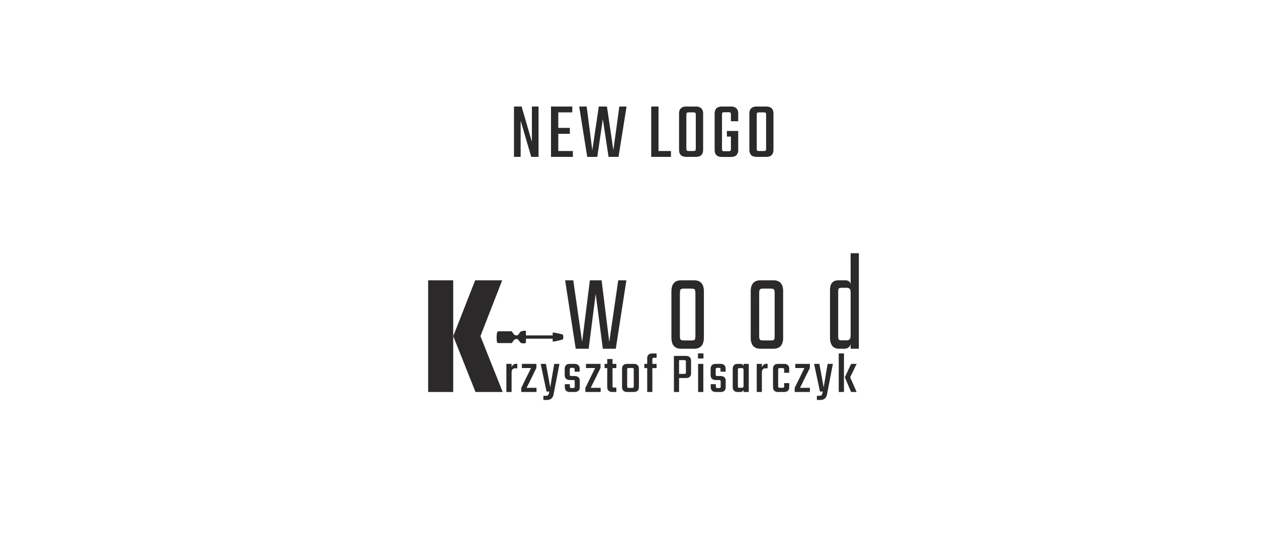
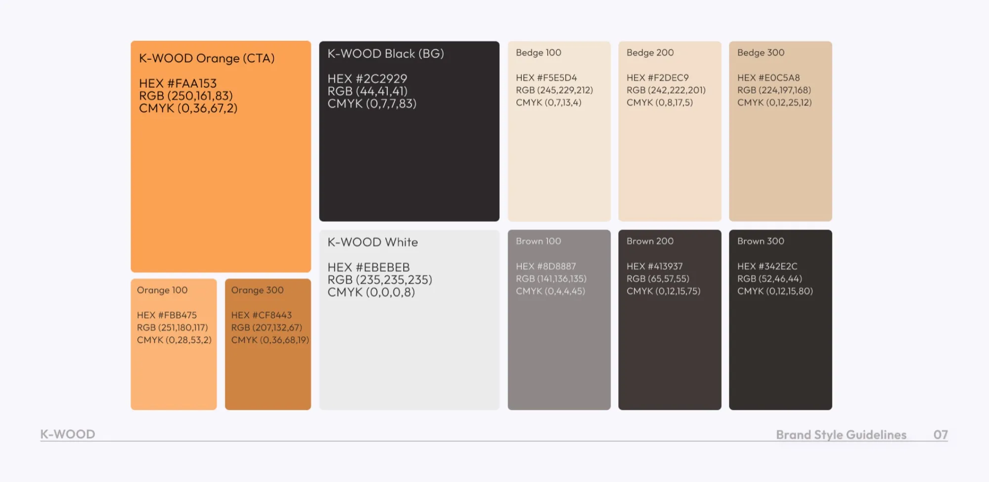
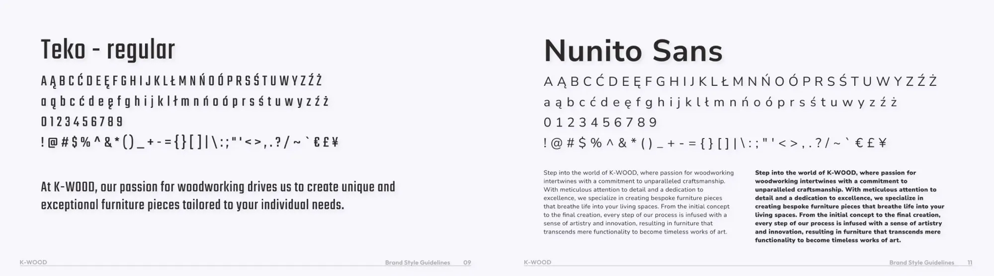
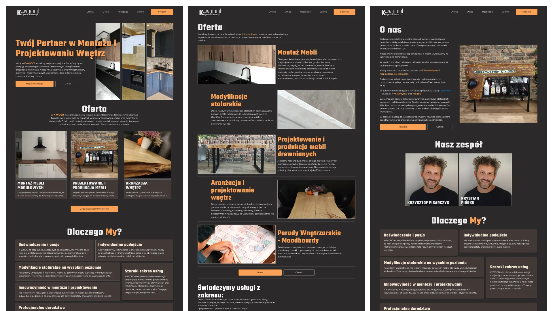
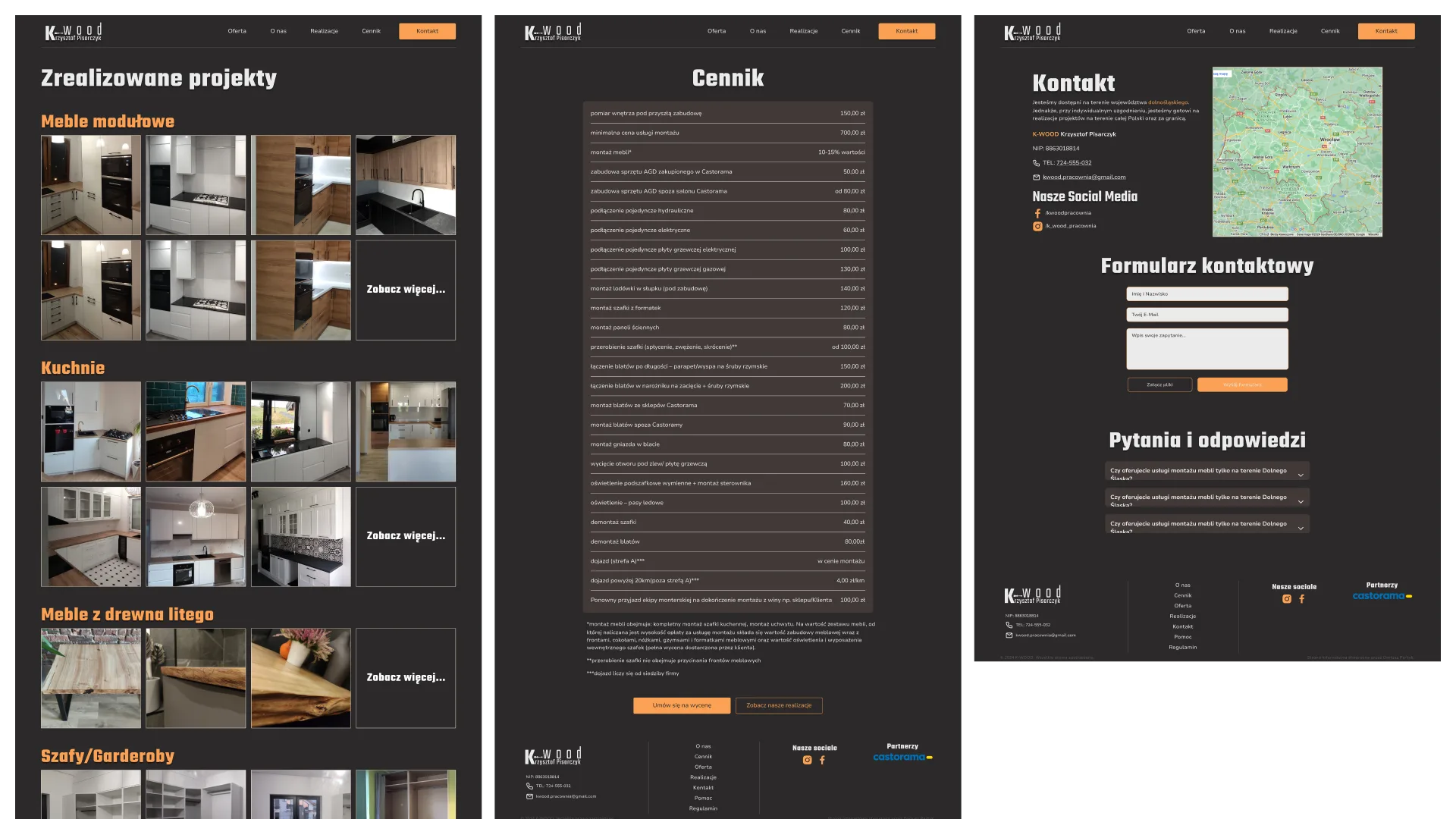
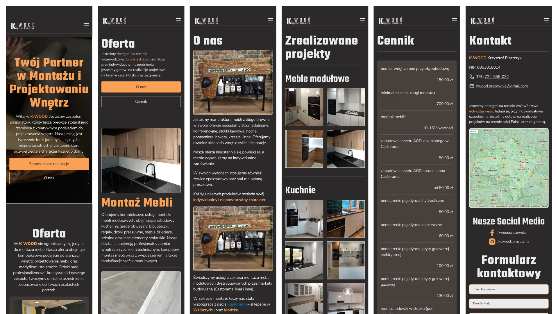
Wireframes came first, on paper and then in Figma, built around the services, the project gallery and contact. Then the logo refresh, a palette of natural browns and deep greens, and a clean, readable typeface. The high-fidelity designs followed an 8px grid and became a clickable prototype, so the client could try the site before development.
Colors
Typography
Development
Built in WordPress with Elementor, with custom HTML/CSS where needed.
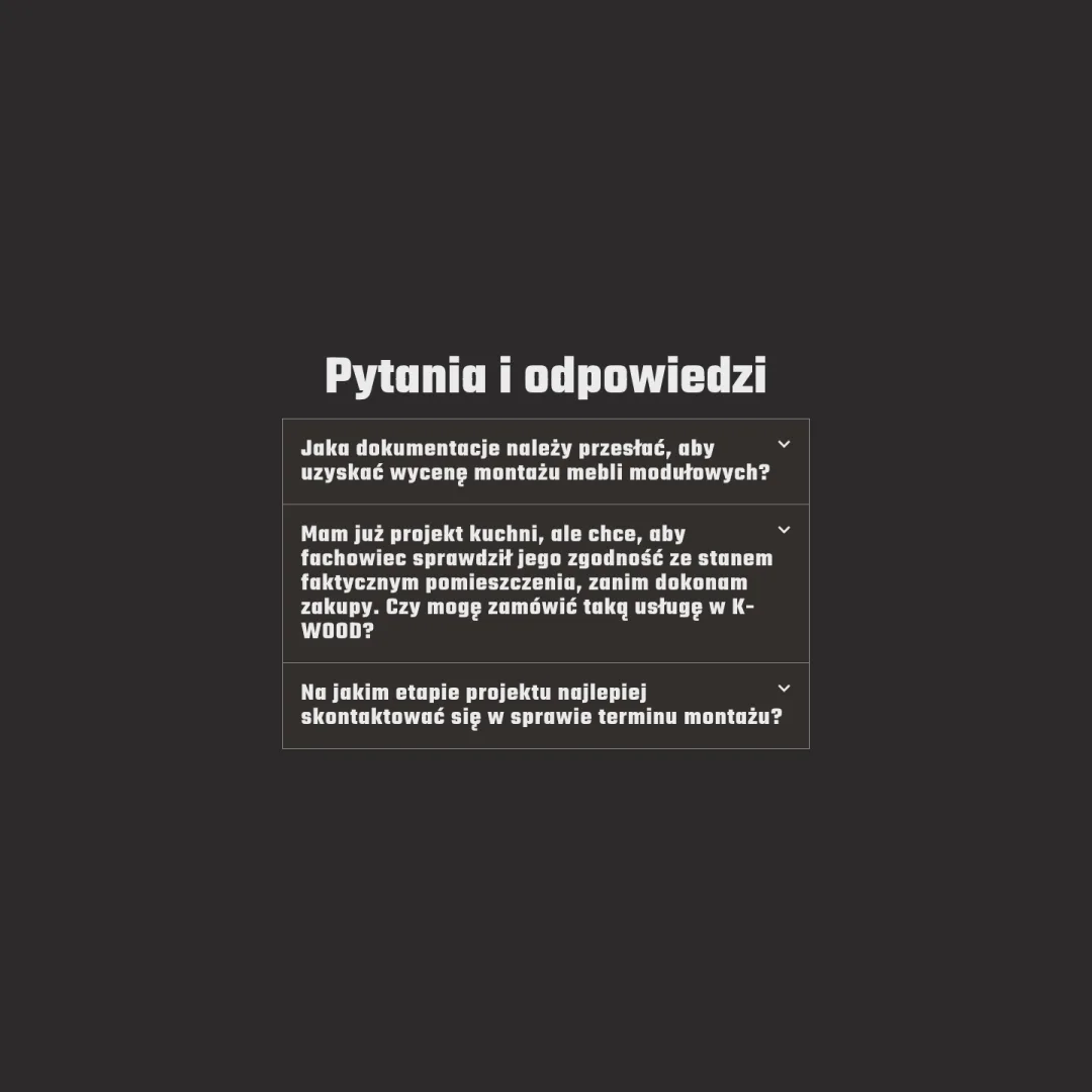
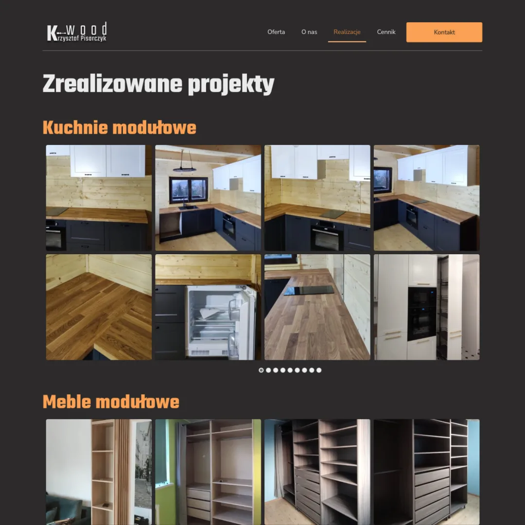
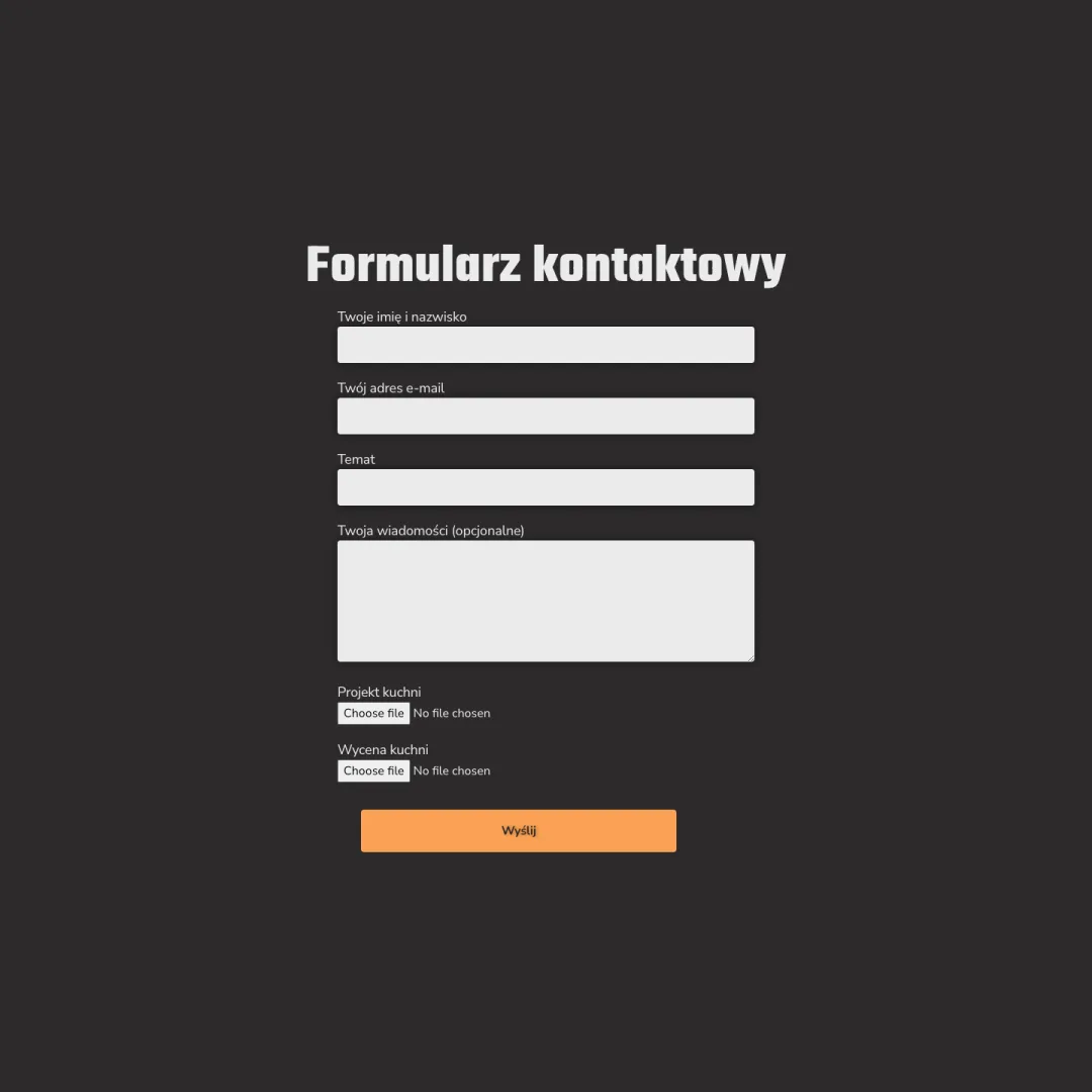
Website needed a gallery, an FAQ and a contact form with file upload. After the build I tested responsiveness across devices, improved loading times, fixed bugs and gathered user feedback.
Launch
Final checks and approval, domain and hosting setup, basic SEO with meta tags and keywords, then go live and handoff to the client.